Bug #956
open
Bubble / Scatter Chart in Prism does not match Power BI output when using identical dataset and field configuration
Description
When the user creates a Bubble / Scatter Chart in Prism Visualization section using the same dataset and identical field mapping (X-axis, Y-axis, Values field, and Bubble Size field) as configured in Power BI, the resulting chart in Prism does not match the output shown in Power BI.
Despite using the same data source and same field placements, discrepancies are observed in bubble positioning, size representation, or aggregated values, leading to inconsistent visualization results between the two platforms.
Actual Result
- Bubble / Scatter chart in Prism shows different results compared to Power BI.
- Bubble positions (X & Y values), size representation, or aggregated values do not align with Power BI output.
- Visual representation is inconsistent even though identical dataset and field configuration are used.
Expected Result
- Bubble / Scatter chart in Prism should produce the same visualization output as Power BI when:
- Same dataset is used
- Same fields are assigned to X-axis and Y-axis
- Same Values field is applied
- Same Bubble Size field is configured
Files
 Updated by ALi RAZA about 2 months ago
- File clipboard-202602171657-1m8jx.png clipboard-202602171657-1m8jx.png added
- File clipboard-202602171657-02qg7.png clipboard-202602171657-02qg7.png added
- Status changed from In Progress to Resolved
- % Done changed from 0 to 100
Resolved - Bubble / Scatter Chart in Prism does not match Power BI output when using identical dataset and field configuration
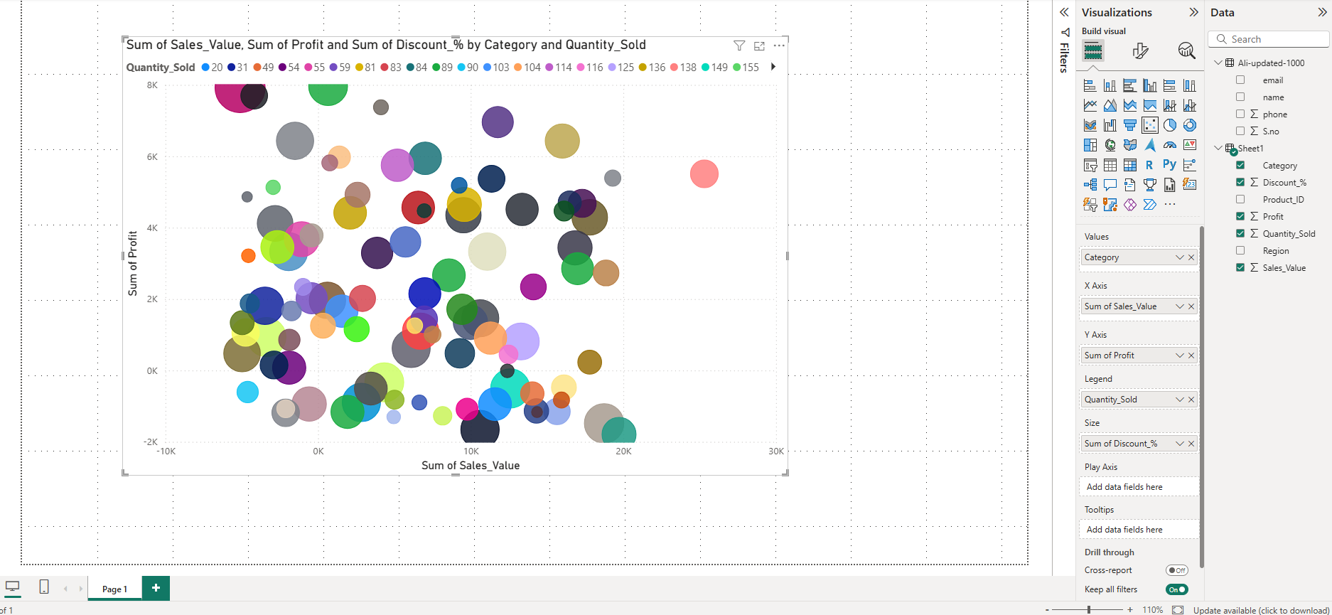
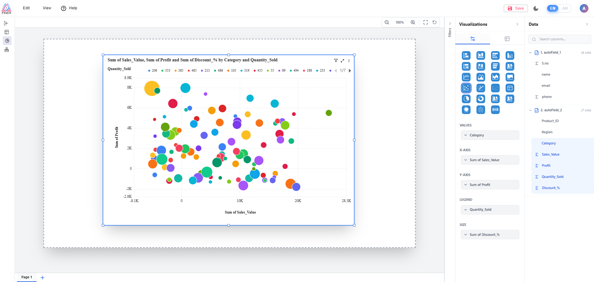
Bubble/Scatter and 3D Bubble Charts Update (Prism vs Power BI)
We have completed a full fix for Bubble/Scatter and Bubble 3D chart mismatches in Prism.
The charts now follow the same behavior as Power BI when using the same dataset and the same field setup (Values, X-Axis, Y-Axis, Legend, and Size).
What was fixed
- Corrected differences in bubble placement so plotted points now align with expected X and Y values.
- Corrected bubble sizing logic so size representation matches the configured Size field.
- Fixed aggregation behavior so results are consistent with Power BI calculations.
- Resolved extra/unwanted bubbles that appeared when a Legend field was added.
- Standardized chart titles to match Power BI-style naming logic.
- Updated tooltip behavior and field order to match expected Power BI presentation.
Bubble/Scatter chart parity work has been completed successfully in Prism, and the visualization output is now aligned with Power BI behavior for the same dataset and field mapping. This update resolves the long-standing inconsistency where users saw different bubble placement, sizes, and summarized values between platforms despite using identical configuration.
The fix ensures that Prism now interprets and renders Bubble/Scatter data in a Power BI-consistent way across key scenarios, including with and without Legend. It also removes misleading extra bubbles that previously appeared in some configurations, and improves how chart titles and tooltip information are presented so users can read and validate results more clearly.
Expected Result
- Bubble / Scatter chart in Prism should produce the same visualization output as Power BI when:
- Same dataset is used
- Same fields are assigned to X-axis and Y-axis
- Same Values field is applied
- Same Bubble Size field is configured
Updated by ALi RAZA about 2 months ago
- Status changed from Resolved to Ready For QA
 Updated by Maryam Farooq about 2 months ago
- Status changed from Ready For QA to Closed
 Updated by Abdullah Jaroudi about 1 month ago
- File Screenshot 2026-03-01 221452.png Screenshot 2026-03-01 221452.png added
- File Screenshot 2026-03-01 221750.png Screenshot 2026-03-01 221750.png added
- File Screenshot 2026-03-01 221557.png Screenshot 2026-03-01 221557.png added
- File Screenshot 2026-03-01 223139.png Screenshot 2026-03-01 223139.png added
- File clipboard-202603012234-ptd3f.png clipboard-202603012234-ptd3f.png added
- Status changed from Closed to Feedback
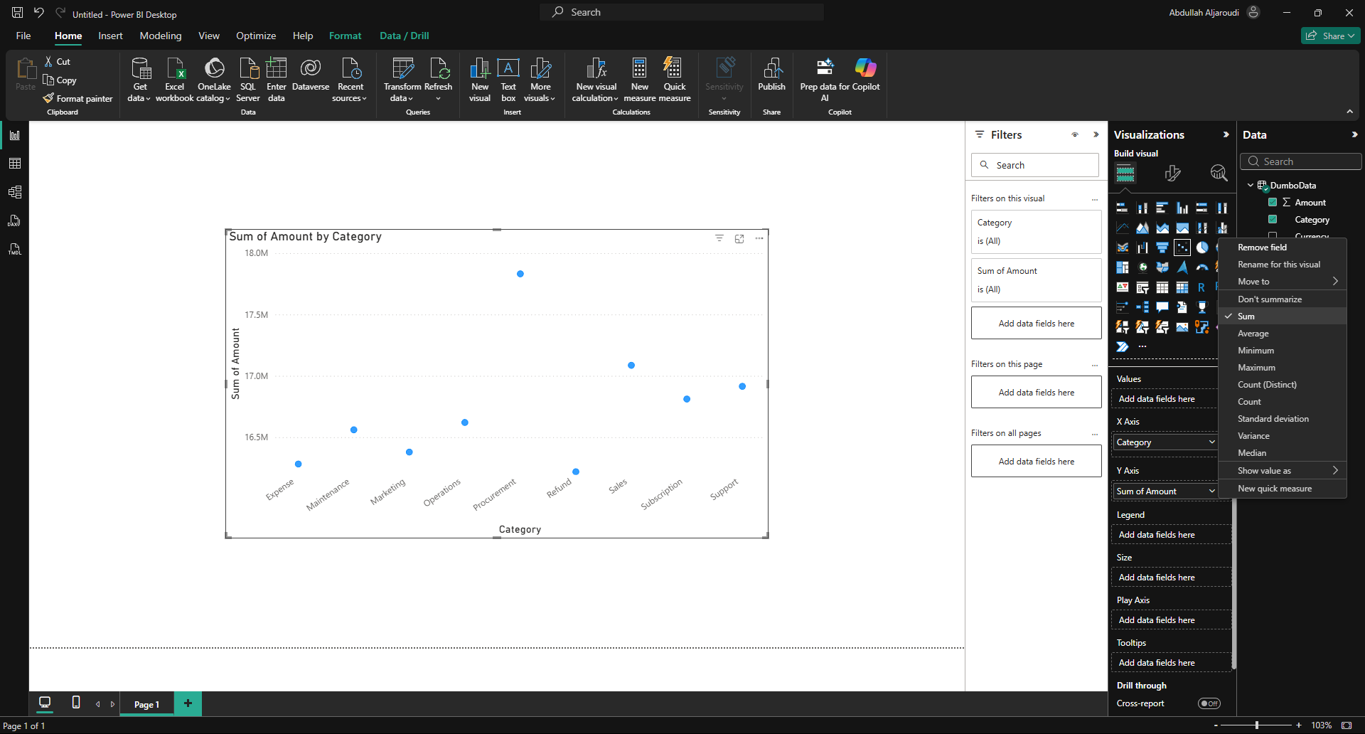
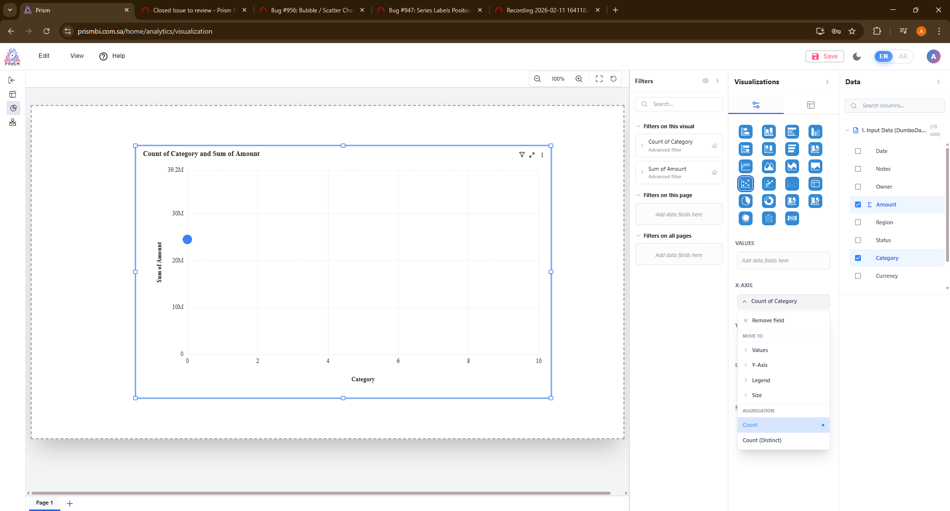
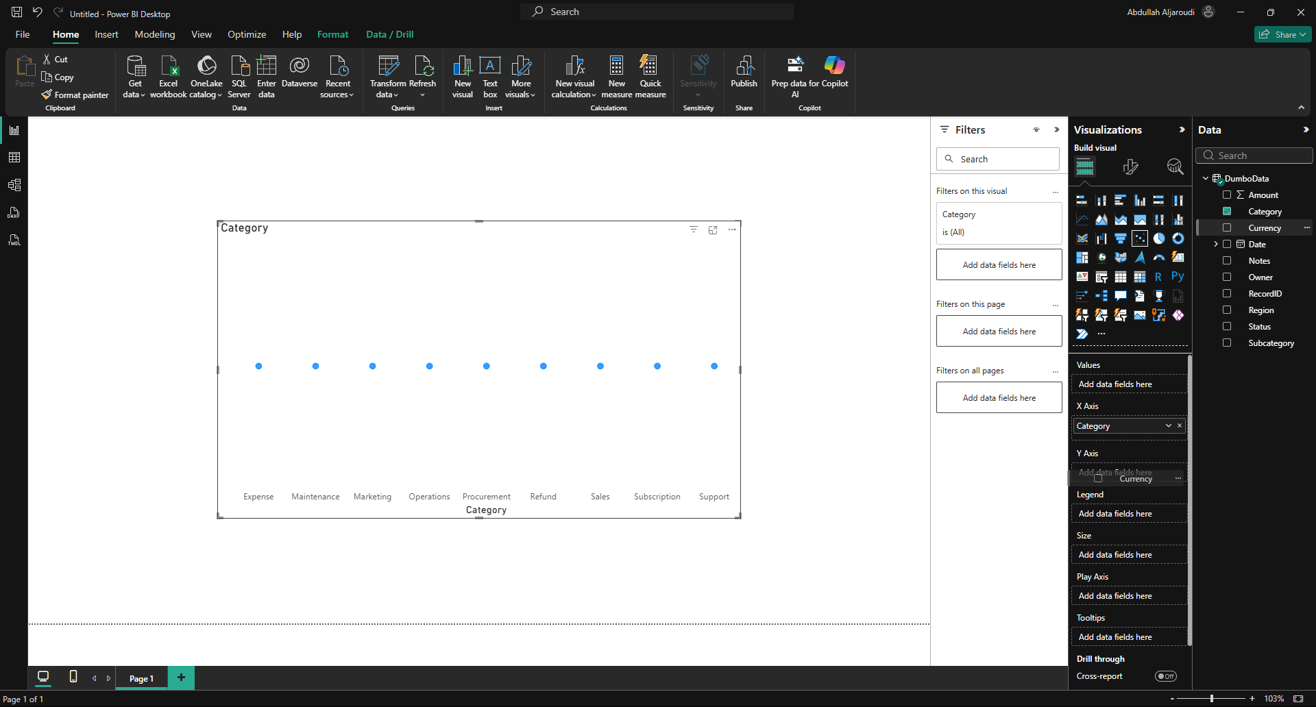
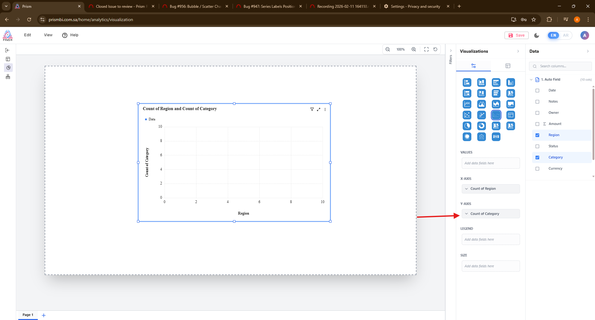
the issue is not solved.
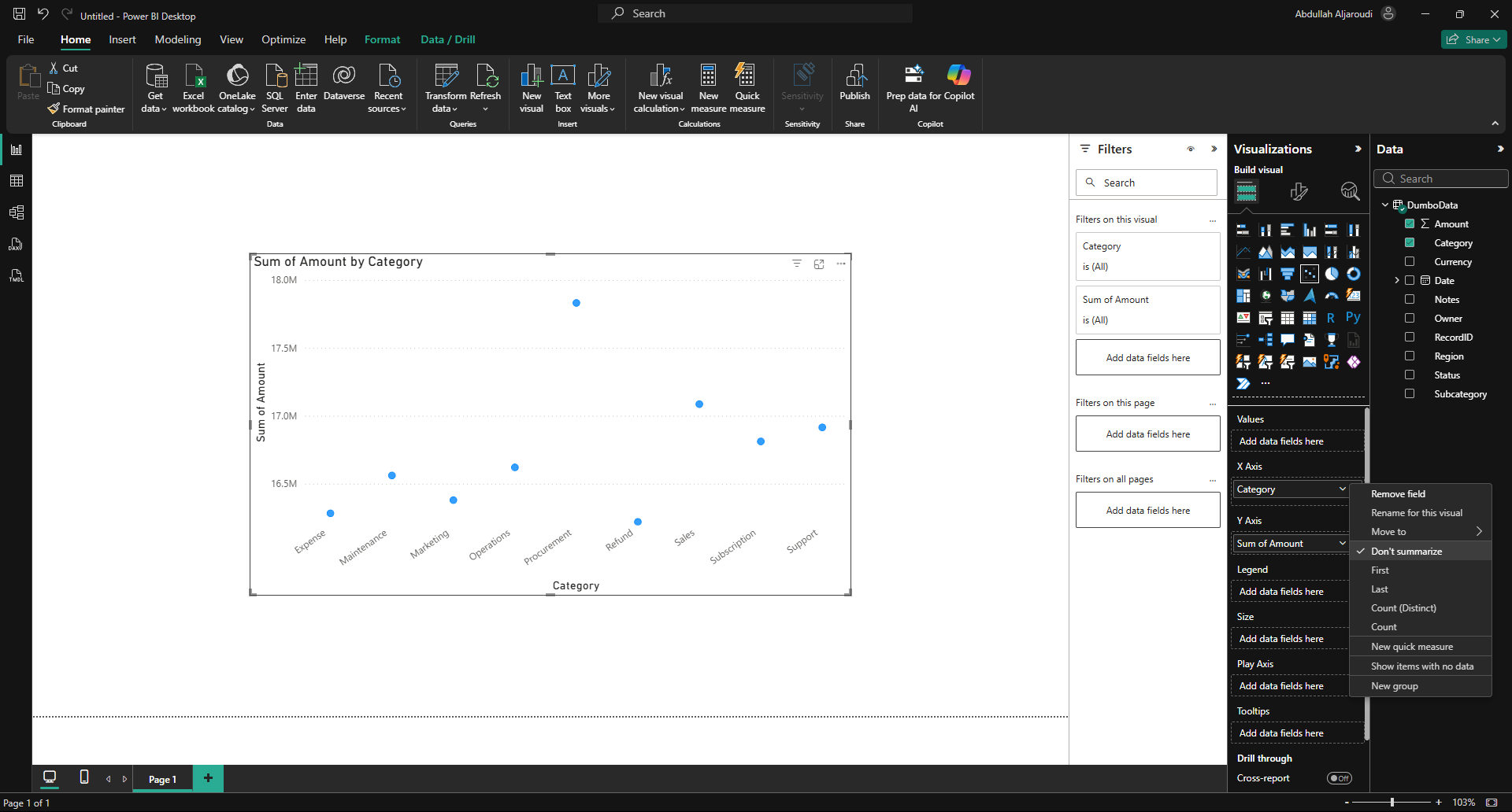
in prism, the data is not accurate, and in X-axis its showing less options than PowerBi. also in Y-Axis it accepts any type of data
In PowerBi, the X-axis is showing more options, and in Y-Axis it only accepts measures.
 Updated by Fareena Anayat about 1 month ago
- Project changed from 16 to Prism Release 2
 Updated by
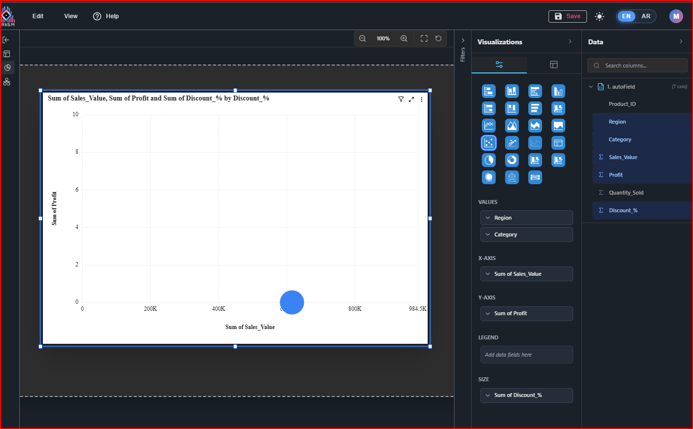